Select a region

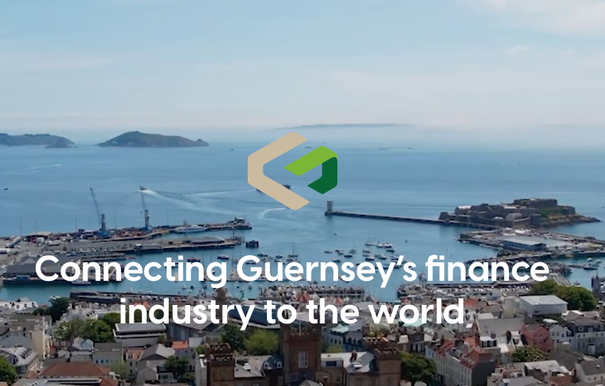

Guernsey Finance has dropped its We Are Guernsey branding.
The branding has been used as its website address, in social media and in its marketing material since the summer of 2016, but has been criticised as creating some confusion.
The promotional body never changed its actual name when that overhaul happened.
It has now launched a new website and new branding.
“Ever since I've been at Guernsey Finance, one of the most consistent questions I get asked on island is, ‘why We Are Guernsey and Guernsey Finance, how do we use them both, how do I introduce you or your colleagues? How does it work?’ And the most common request again is ‘please can return to Guernsey Finance’,” said Guernsey Finance Deputy Chief Executive Barnaby Molloy at its annual industry update.
“So when we realised that the website needed more than just a few tweaks, it actually needed a material rebuild, it felt like the right opportunity to return to Guernsey Finance.”
The branding needed to work in different circumstances.
“We need to look appropriate if we're sitting alongside a very traditional organisation, a very traditional bank, or on the other end of the spectrum, we're sitting in front of a very innovative tech business.”
They were working in a highly competitive market, he said.
“There are very few USPs, very few differentiators, and Guernsey Finance has historically linked into that to give us a marginal gain. And we want to keep all that marginal gain. So it needs to look good. That's really, really important. But also we have to be mindful of the current day's position; focuses around substance, around innovation, around sustainability, are all very important.”
The rebrand was an internal project with creative direction provided at the start by the team at The Potting Shed.
Mr Molloy highlighted some of the detail of the design work.
The G and F iconography was formed of positive and negative space, exemplifying the fact the island creates products that fitted perfectly together.
The colour palette was deliberately simple, the green synonymous with Guernsey, positivity, action and go.
Sustainability was important, he said.
“We continue to position as good global citizens.”
The Guernsey Finance website receives more than 100,000 visitors from over 177 different countries every year.
“It needs to be able to be helpful, be intuitive, it needs to be smart and needs to be presentable.”
The business directory has been given more prominence, there is also more imagery of the Guernsey Finance team.
All the content has been updated and made more succinct.
There was also now a focus on video.


Comments
Comments on this story express the views of the commentator only, not Bailiwick Publishing. We are unable to guarantee the accuracy of any of those comments.